Charts make complicated ideas simple to understand visually. Forget boring pie graphs from school; we’re talking about cool visuals that are actually interesting. Get ready to learn fun facts that won’t make your brain hurt!
Check Out This Chart Before Getting a Tattoo
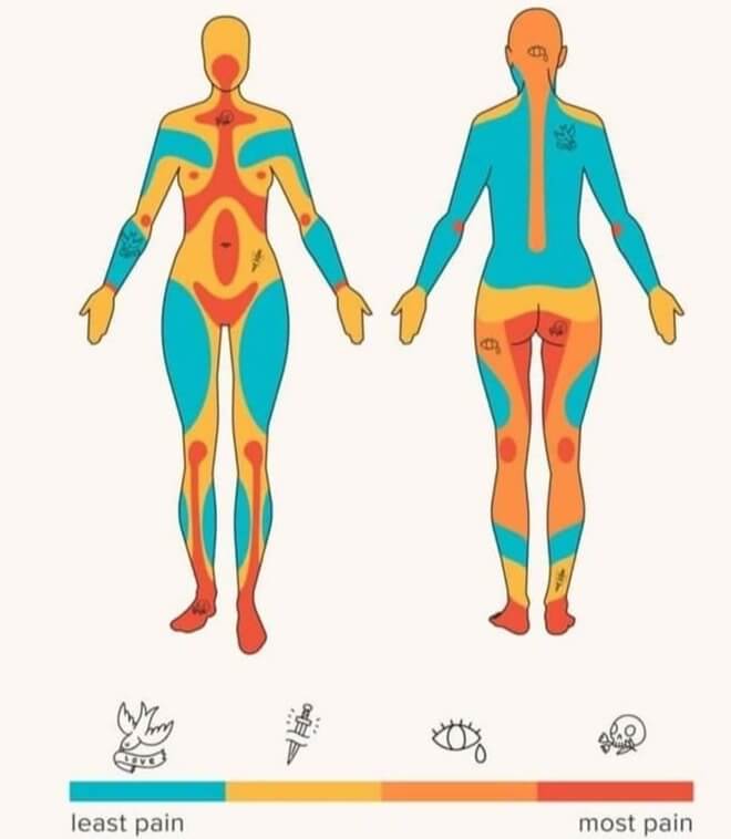
Before getting a tattoo, check out this chart that shows how painful each area can be. Some are obvious, like the ribs, but others, like the upper chest, might surprise you. Facial and calf areas make sense for more pain. So, if you’re thinking ink, consider this pain map first!
How Secure Is Your Password?
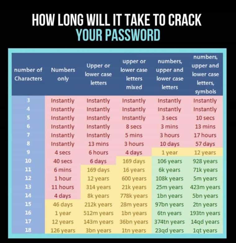
Ever wondered how secure your passwords are? Well, this chart breaks it down, estimating how long it takes to crack them. Even eight-character passwords aren’t very safe. It’s a bit unsettling, considering the tools available. Time to up your password game!
The Development of a Baby’s Vision

If you’ve got a newborn, you might think they can see your face clearly, but this chart says otherwise. Babies can’t make out facial features until around three months. Things get clearer at six months and fairly sharp at one year. Full vision development happens by the time they’re three.
The Evolution of the Alphabet
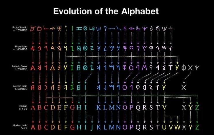
Curious about the evolution of Latin-based alphabets? This chart gives a visual journey through the historical changes in letter appearances. It’s fascinating to see how, for instance, what began as the letter “T” transforms into the letter “U,” and the original form of the letter producing the “T” sound looked like a “W.” Take a closer look for some intriguing insights!
Curious What It’s Like to Have Colorblindness?
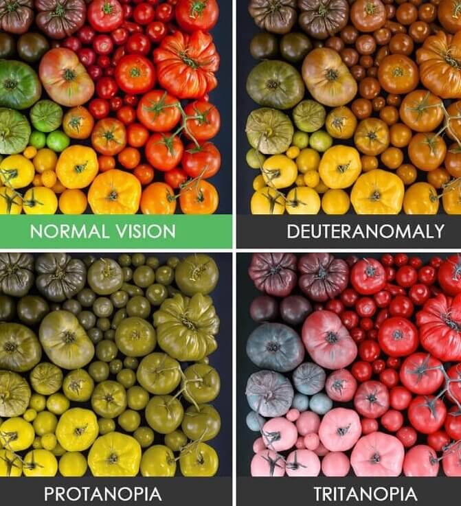
Ever wondered what it’s like to experience colorblindness? This chart compares four different perspectives using a photo of vegetables. The top left shows what someone with normal vision sees, while the others represent how the same photo appears for those who are colorblind. It’s a glimpse into a different way of seeing the world!
What Human Emotions Look Like in Our Bodies
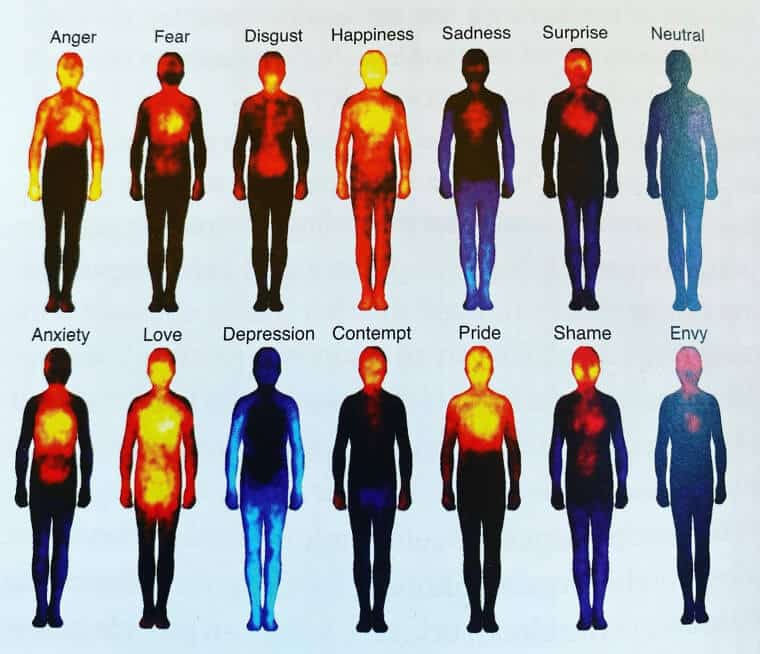
Check out this unique chart—it’s like a heat map for emotions, showing where in your body different feelings tend to be felt, whether as heat or numbness. It’s a perspective-shifting view. The depression heat map is quite poignant, while the representations for love and happiness make intuitive sense. Emotions laid out visually!
Think Twice Before Putting New Stickers on Your Car
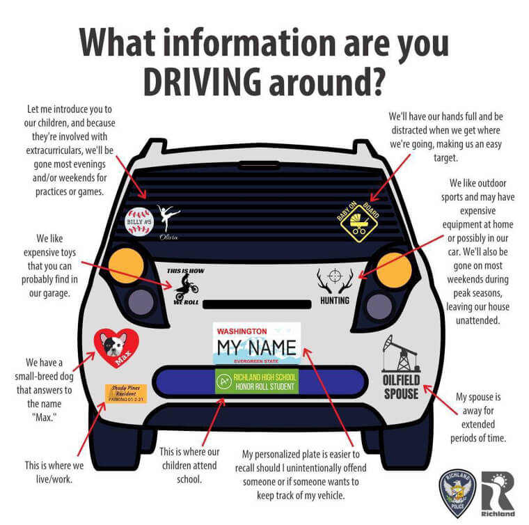
Ever wondered what your bumper sticker says about you? This chart breaks down common stickers and their potential meanings. For instance, an oil rig sticker might suggest that your spouse is often away for refinery or offshore work. It’s a fun way to think about the messages we broadcast on our cars!
Land Formations Finally Explained in a Way We Can Understand
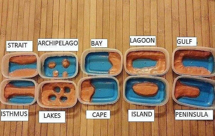
Recall those grade school lessons on land formations? This chart simplifies it, covering everything from islands to isthmuses. Familiar ones like mountains are here, but it’s also intriguing to see less common features like lagoons, capes, and isthmuses alongside their more well-known counterparts. It’s a neat visual refresher on land diversity!
College Tuition Has Gotten Out of Hand
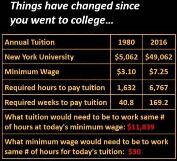
This non-political chart illustrates the widening gap between medium incomes and college education over time. In 1980, working minimum wage for $3.10 per hour could cover tuition in about 40 weeks. By 2016, it had risen to around 169 weeks. The chart also indicates the minimum wage needed to match the number of working weeks in 1980. It’s a snapshot of the changing dynamics between income, education costs, and time.
But on the Bright Side…

Building on the college tuition chart, this one explores the earnings potential of trade jobs for those skipping college. It might surprise you to see the high pay of a hairdresser, emphasizing that lucrative opportunities exist without a traditional degree. The chart aligns with expectations for many other trade jobs. It’s a reminder that success comes in various forms and career paths!
Which Birth Dates Are Most Common?
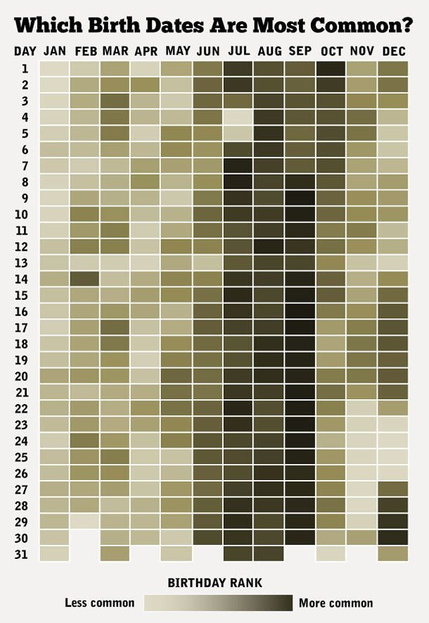
Ever met someone with your birthday? This chart reveals the commonality of different birthdays throughout the year, showing how frequent or rare yours is. It’s a bit odd yet intriguing to think about the patterns and what makes certain birthdays more common. There’s some cool information packed into this chart, sparking curiosity about the factors shaping birthday distribution!
A Handy Trick to Remember the Days of Each Month
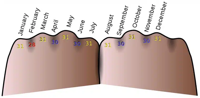
Here’s a handy (pardon the pun) chart to remember the days in each month. Use your knuckles: each knuckle month has 31 days, the spaces in between usually have 30 days, and February stands alone with 28 days. Remembering that odd month, and you’re all set!
What Hair Color Will Your Children or Grandchildren Have?
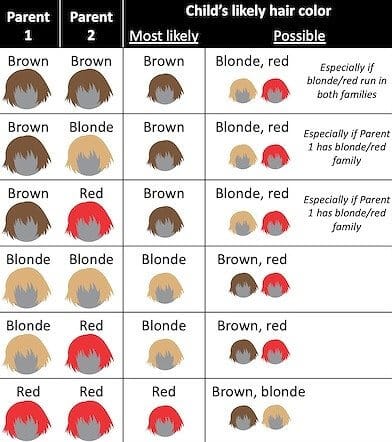
Predicting a child’s hair color can be fun for expecting parents. While this chart won’t guarantee accuracy, it’s interesting to explore. Surprisingly, red hair seems to make an appearance regardless of the parents’ hair color. It adds a fascinating twist to the usual assumptions about hereditary traits. Enjoy the anticipation of what might be!
These Companies Hire Felons

This valuable information lists companies that commonly hire individuals with a felony record. It’s particularly noteworthy because finding employment after serving time can be challenging, and this difficulty may contribute to a cycle of incarceration. Offering job opportunities for those looking to restart their lives is a positive step towards breaking that cycle.
How Much You Have to Make to Join the 1%
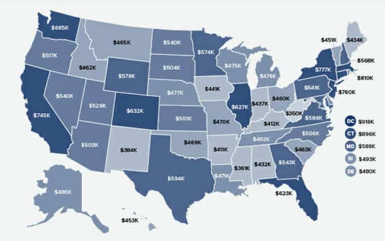
This chart is quite revealing, showing the income required in each state to be considered part of the 1%. Beyond illustrating the financial threshold, it also highlights the significant variations in the cost of living across the United States. It’s a compelling visual representation of the economic diversity within the country.
How Long Adopted Dogs Need to Feel at Home
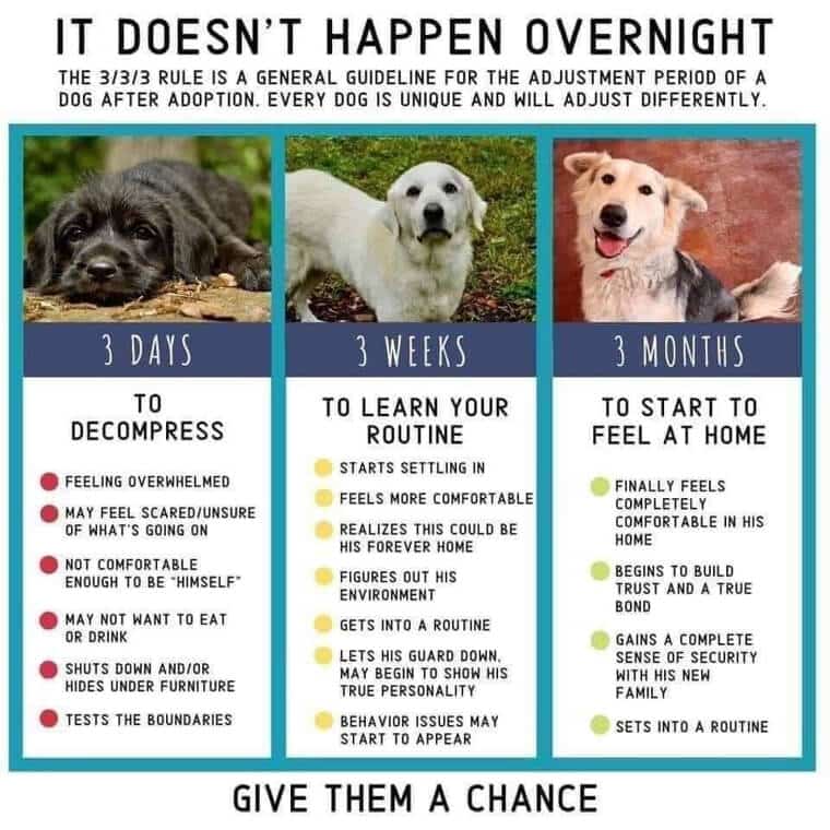
Building a bond with your canine companion takes time, and this chart maps out when you can expect to see certain behaviors develop. It’s a reminder that, just like humans, dogs need time to feel at home and comfortable in their new environment. Understanding these timelines can enhance the relationship between pet and owner.
Macaroon Vs. Macaron Vs. Macron

Learning French pronunciation can be challenging, but this chart makes it easier for English speakers. It provides clear pronunciations of common French words like “macaron” and “Macron,” with the latter being the French president. The added definitions are a nice touch for those looking to deepen their understanding. Thanks, France, for helping us navigate the linguistic nuances!
How to Get the Chef to Hate You

Discover this useful guide found on a restaurant menu, likely at a steakhouse. It walks diners through the various levels of doneness for steaks, from rare to well-done, offering a humorous comment for those who prefer their steaks well done. A handy and amusing guide to ensure everyone gets their steak just the way they like it!


